THE BRIEF
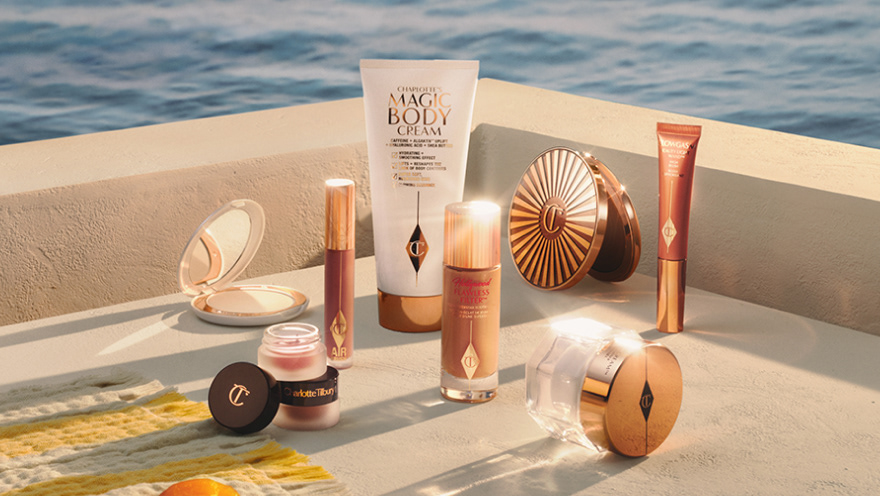
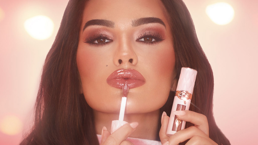
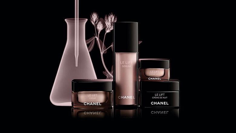
The launch of Flannels Beauty was a large scale project in order to bring premium beauty brands to our Flannels customers. This particular part of the project focuses on the design and build of the beauty landing page, a key stepping stone for the Flannels Beauty user.
The launch of Flannels Beauty was a large scale project in order to bring premium beauty brands to our Flannels customers. This particular part of the project focuses on the design and build of the beauty landing page, a key stepping stone for the Flannels Beauty user.
Working closely with the Beauty Ecommerce Trading Manager and wider front-end development team in order to launch a landing page with full of key information for customers, as well as keeping strong commercial sections available for brands to purchase online retail space.
Challenges within this project included working within a unique set of sub brand guidelines for Flannels Beauty, as well as ensuring the page displayed all the relevant information provided from the trading team in a clear and precise way for the users.
MY ROLE
My responsibility during this project was to deliver a clean UI template for the beauty landing page, ensuring targets of the trading team were met through keeping a commercial edge. Bringing in the sub brand guidelines to the design to create both a unique presence as well as fitting seamlessly into the wider Flannels site.
My responsibility during this project was to deliver a clean UI template for the beauty landing page, ensuring targets of the trading team were met through keeping a commercial edge. Bringing in the sub brand guidelines to the design to create both a unique presence as well as fitting seamlessly into the wider Flannels site.
DESIGN STAGES
Following some initial research with some competitor sites, I approached the design first by sketching a few initial wireframes, then moved onto using some assets provided from the brand guidelines mocking together some layouts for the multiple sections required.
• A category slider (skincare, makeup, haircare etc)
• A selection of bestseller products (max 8 for load times)
• Beauty news articles,
• Tutorial hub
• Section for online services (Foundation colour matcher etc)
• Selection of product edits such as vegan beauty, products for oily skin etc
• Call out section with selection of categories
• Store services (personal shopping, Style & collect and Restaurant) & Store locator
Following weekly feedback sessions I experimented with various layouts and implementing a key colour in order to give Flannels Beauty a unique offering, however this didn't quite work sat alongside the existing Flannels brand.
I also wanted to create a template that was interchangeable going forward, for example the brand retail space below the hero could be expanded or reduced depending on requirements, as well as multiple CTA locations following brand imagery guidelines. Each section of the page can also be removed or added without effecting the flow of the page, an example of this was an additional section added last minute to include social media links.
Following on from wireframing I also worked on some working prototypes in order to best represent my ideas to the front-end development team. This one shows the bestsellers product carousel.
PAIN POINTS
Due to the vast amount of sections and information to be included on the page, in order to not overwhelm users, I included a navigation bar anchoring to the sections throughout the page. This created a clear user journey at the top of the page, enabling the users to either quickly shop by category or explore further features of Flannels Beauty.
Due to the vast amount of sections and information to be included on the page, in order to not overwhelm users, I included a navigation bar anchoring to the sections throughout the page. This created a clear user journey at the top of the page, enabling the users to either quickly shop by category or explore further features of Flannels Beauty.
Another pain point of the project was to ensure the landing page design elements could be adapted to work across parts of the beauty PDP's (product display page's) and PLP's (product landing page's). An example of this was adapting the vertical titles back to horizontal in order to seamlessly fit across various pages.
RESULTS
Reflecting back on the project, I'd like to do some more work into the navigation of the page. Looking into user research and how users interact with the categories and navigation to decipher the priorities of a Flannels Beauty user.
Reflecting back on the project, I'd like to do some more work into the navigation of the page. Looking into user research and how users interact with the categories and navigation to decipher the priorities of a Flannels Beauty user.
Overall, the UI of the page was greatly received with positive feedback from senior management.
This project continues to be something I'm proud of working on, seeing assets continually being updated following various brand partnerships It's great to see the adaptability of the design.
