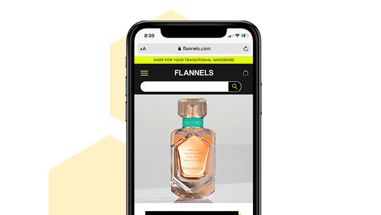
Frasers Group embarked on a comprehensive digital transformation initiative aimed at enhancing customer experience across all touchpoints.
As part of this elevation strategy, the transactional email communications were identified as a critical area needing improvement due to outdated designs and inconsistent branding, which were causing customer confusion and diminishing trust.
MY ROLE
I was the lead digital designer throughout the project working on elevating the UI design of the current email communications. I also worked closely with the front end development team to ensure consistency across the multiple communications.
I was the lead digital designer throughout the project working on elevating the UI design of the current email communications. I also worked closely with the front end development team to ensure consistency across the multiple communications.
PROJECT SUMMARY
The goal of the project was to elevate the current outdated email communications, providing a consistent look and feel throughout the purchasing user journey. This included updated UI designs for an 'order confirmation' email communication through to a newly introduced 'order delivered' email communication.
The goal of the project was to elevate the current outdated email communications, providing a consistent look and feel throughout the purchasing user journey. This included updated UI designs for an 'order confirmation' email communication through to a newly introduced 'order delivered' email communication.
The elevated designs followed best practice methods for order email communications as well as consideration into colour contrast usage and font sizing accessibility regulations. Although the updated designs were created with a mobile first approach, responsive desktop versions were also created.
The project was widely appreciated with senior management commenting on the vast visual improvement to the email communications, further elevating the brands reputation to our customers.
THE OBJECTIVES
Enhance Brand Consistency: Align transactional emails with the updated e-commerce website and marketing communications to present a unified brand image.
Improve User Experience: Redesign email templates to be more intuitive and user-friendly, reducing customer inquiries and increasing engagement.
Ensure Accessibility: Update designs to meet WCAG guidelines, ensuring inclusivity for all users.
Optimize for Mobile: Adopt a mobile-first approach to cater to the increasing number of users accessing emails via mobile devices.
RESEARCH & ANALYSIS
Conducted a comprehensive audit of existing transactional emails.
Performed competitor analysis and reviewed best practices from sources like Baymard Institute.
Identified key pain points leading to customer confusion and mistrust.
DESIGN & PROTOTYPING
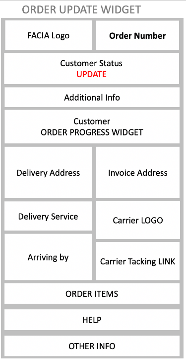
Developed wireframes and high-fidelity mockups for various transactional emails, including order confirmation and delivery notifications.
Introduced a visual timeline component to clearly communicate order progression, inspired by positive user feedback from competitor analyses.
Ensured designs adhered to brand guidelines while also being adaptable for different facias within the Frasers Group portfolio.


ACCESSIBILITY & RESPONSIVENESS
Participated in accessibility workshops to understand and implement WCAG guidelines.
Adjusted colour contrasts and font sizes to enhance readability.
Designed responsive templates optimised for both mobile and desktop email clients.
COLLABORATION & IMPLEMENTATION
Worked closely with the front-end development team to ensure accurate translation of designs into code.
Worked closely with the front-end development team to ensure accurate translation of designs into code.
Established a modular design system to facilitate easy updates and scalability across various brands.
OUTCOMES
NEXT STEPS
Enhanced Customer Trust: The updated emails provided a consistent and professional appearance, reinforcing brand credibility.
Reduced Customer Inquiries: Clearer communication led to a decrease in customer service contacts related to order status.
Positive Stakeholder Feedback: Senior management praised the visual improvements and the strategic alignment with the broader digital transformation goals.
Foundation for Future Enhancements: The modular design approach allowed for easy adaptation across different brands and set the stage for further enhancements in the user journey, including the 'My Account' section.
Brand Adaptation: Customise the modular templates for other brands within the Frasers Group, ensuring each maintains its unique identity while adhering to the overarching design principles.
Extended User Journey Integration: Expand the visual timeline component to the 'My Account' section, providing users with a cohesive and informative experience throughout their interaction with the brand.

