THE BRIEF
Create an exciting and engaging look and feel for the launch of Charlotte's New! Loyalty Programme, enticing both new customers to join the programme and educate existing members on their new rewards and benefits. Achieving a successful launch both on time with a strong creative UI alongside a clear and easy to use UX.
The creative needs to be on brand and have a magical bright star and universe feel.
MY ROLE
My role and responsibility during this project was to lead on the creative delivery for the relaunch of Charlotte's Loyalty Programme. Working closely with the senior UX designer to deliver on brand creative assets for the loyalty landing page, customer account page, as well as a collective of marketing assets for launch, including launch email and automated email designs.
My role and responsibility during this project was to lead on the creative delivery for the relaunch of Charlotte's Loyalty Programme. Working closely with the senior UX designer to deliver on brand creative assets for the loyalty landing page, customer account page, as well as a collective of marketing assets for launch, including launch email and automated email designs.
DESIGN STAGES
Following some initial research looking at both competitor and successful loyalty programmes, I approached the design first by understanding the UX, collaborating with the Digital product designer to fully understand the extent of the brief.
• Research into loyalty programmes
• Working closely with digital product designer to understand the UX
•. Initial UI design concept
•. Iconography to get 'at a glance' your loyalty level
•. Ensure design shouts magical Charlotte Tilbury
•. Consider accessibility at all points to ensure UX isn't lost
• Asset delivery on time for launch
RESEARCH EXPLORATION
Shown below is a selection of competitor sites, as well as successful loyalty schemes such as Boots, looking firstly at these enabled me to discover the opportunities for creative both on the landing pages and within the account pages.
Shown below is a selection of competitor sites, as well as successful loyalty schemes such as Boots, looking firstly at these enabled me to discover the opportunities for creative both on the landing pages and within the account pages.
It was clear the account pages needed to be simple and clear, instantly showing the users their points or account level. Whereas the landing pages could be more creative, taking the users on a journey through the loyalty programme and what was on offer.
INITIAL DESIGN ADAPTATION
Working with a wireframe provided from the UX team (first frame on the left), I started my design journey with some simple text and colour applications, keeping in mind the title copy needed to be live text to ensure accessibility. I looked at adding some brand flares as well as including a point to the hero in order to lead users down the page to find out how the programme works.
Knowing that icons resonate with our users, I decided it would be beneficial to include icons for each loyalty level, ensuring users could 'get at a glance' from landing on their account page their current loyalty level.
I experimented with a few variants for this with two key pathways of diamonds or coin/metal based levels.
DEVELOPING ICONS
The next stage of the design I focused on the icons for the levels, knowing Charlotte Tilbury herself was looking for the magical sparkle elements added to the creative, I worked on developing a diamond icon, something in keeping with the brand and symbolising luxury, with levels identified by a simple colour step change.
I also looked into another option using sparkle in the literal sense of metals, pulling inspiration from the olympic medals being something users instantly understand. Working closely with the Design Director we looked into also going further than the medals and including a gold bar and diamond to symbolise the progression through the levels.
Following presenting the two pathways of icons to the Director of Brand Creative, we took the diamond path into further development. Looking at how to improve accessibility and ensure the icons improved the overall UX of the page.
One of these avenues explored is shown here, using some elements of the other loyalty icons to pull them together and create a consistent experience. These however aren't accessible at all and don't improve the customer to 'get at a glance' their current loyalty level.
MAKE IT POP
The creative was still missing its magical element and needed some Charlotte Tilbury sparkle. I experimented with varying levels of sparkle, working with the Design Director to ensure we had something Charlotte herself would be able to resonate with.
The creative was still missing its magical element and needed some Charlotte Tilbury sparkle. I experimented with varying levels of sparkle, working with the Design Director to ensure we had something Charlotte herself would be able to resonate with.
Working with and adapting stock imagery alongside imagery we had used previously for the loyalty programme, I developed a brighter more magical and engaging landing page hero.
ACCESSIBILITY ADJUSTMENTS
Following design approval I knew we needed to do some adjusting to the sparkles to ensure maximum accessibility with the body copy on the dark night crimson background.
In order to do this without reducing the sparkle and magic, I worked into the hero assets some dark overlays in rough areas the text would be overlaid, ensuring this was also tested across devices.
Short user video showing the UX function combined with the UI added flares as well as diamond icon levels following you through the loyalty levels.
LOYALTY LANDING PAGE
Final Landing page design for non logged in users to both access the loyalty programme and discover more about the magic rewards and benefits.
Final Landing page design for non logged in users to both access the loyalty programme and discover more about the magic rewards and benefits.
LOYALTY ACCOUNT PAGE
Once logged into their account this is the landing page users are greeted with.
Once logged into their account this is the landing page users are greeted with.
RESULTS
Reflecting back on the project, I'd like to do some more work into improving the accessibility of the landing page.
Reflecting back on the project, I'd like to do some more work into improving the accessibility of the landing page.
Overall, the creative design of the loyalty programme was greatly received with positive feedback from senior management including the Senior Loyalty Manager and Leah Tilbury, Director of Brand Creative.
This project as a whole is still continuing with new initiatives coming to the loyalty programme, such as Magic Members Week, meaning continued use of the loyalty creative across multiple assets on charlottetilbury.com. The creative is now being rolled out by multiple creative teams such as video, social and virtual stores.
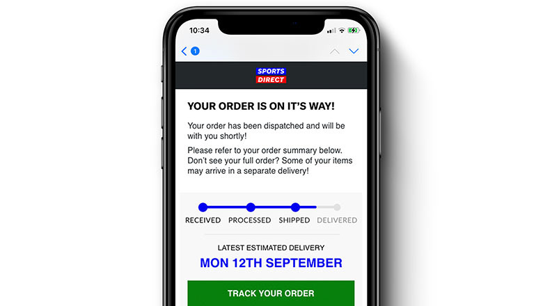
Part of the creative work on this project included design of the automated loyalty emails, two of which you can see below. These emails consist of initial 'welcome to Charlotte's Loyalty Programme' through to 'You have unlocked the vault!' emails, all of which feature a loyalty card of rewards and benefits for the users current loyalty level. Following the launch of the new programme and these emails, they're now the best performing email marketing for the company.


