OVERVIEW
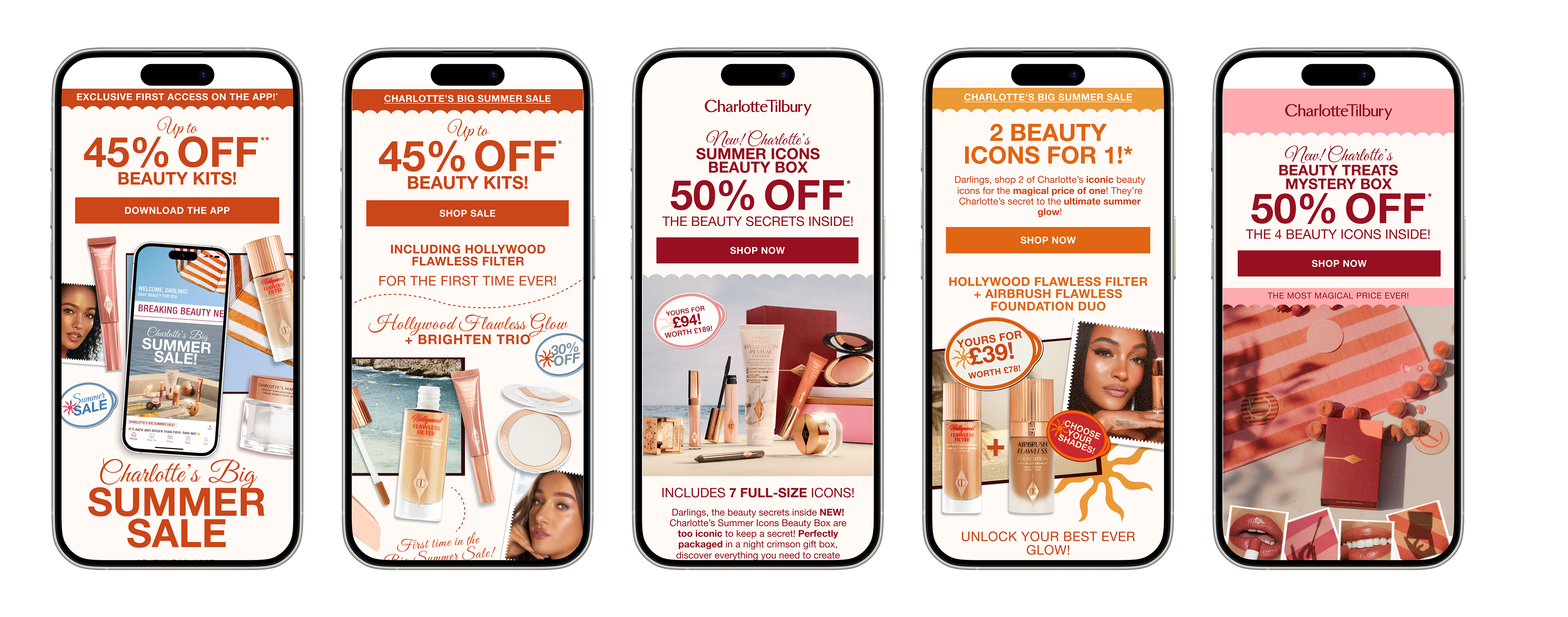
Charlotte Tilbury’s Summer Sale refresh aims to capture seasonal energy, spotlight time-sensitive deals, and drive conversions, all while staying true to the the brand’s luxe aesthetic. This iteration builds on the existing visual identity but leans in more boldly on urgency, warmth, and visual drama to encourage engagement over a limited window.
OBJECTIVES
Objective: Elevate the Summer Sale experience, increase clickthroughs and conversions on hero banners, bundles, and deals; maximise engagement with seasonal promos.
KPIs: Hero banner CTR, conversion rate on sale pages, average order value uplift (via bundles), engagement time (dwell), drop-off reduction in scroll.
Constraints & Considerations: The design must integrate seamlessly with Charlotte Tilbury’s brand (pink / rose gold / premium), avoid clutter, maintain legibility, and perform well across devices.

MY ROLE AND APPROACH
Lead digital / UI designer for the launch
Responsible for ideation, visual design, responsive layouts, component design (cards, banners, badges), interaction animations
Collaborated with marketing (for promotional messaging), content / copy, and creative artworkers (to ensure elevated brand visuals)
RESEARCH
Benchmarking: Surveyed seasonal promos from beauty / luxury brands to see how they balance warmth, urgency, and product emphasis (e.g. warm gradient overlays, soft glows, bold discount badges).
User insights / analytics: From prior sale campaigns, users typically glance at hero zone, then jump into “top deals,” then scan bundles / cross-sells. Putting urgency cues early helps reduce drop-off.
Brand integrity: Charlotte Tilbury has a well-defined palette (rosy pinks, warm cosmetics tones, gold accents). The challenge: augment that palette for Summer Sale without diluting brand consistency.
VISUAL DIRECTION
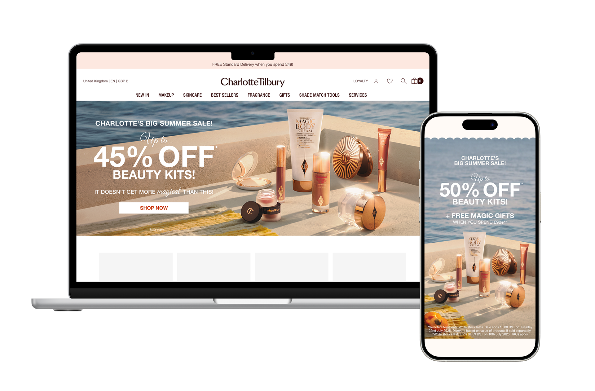
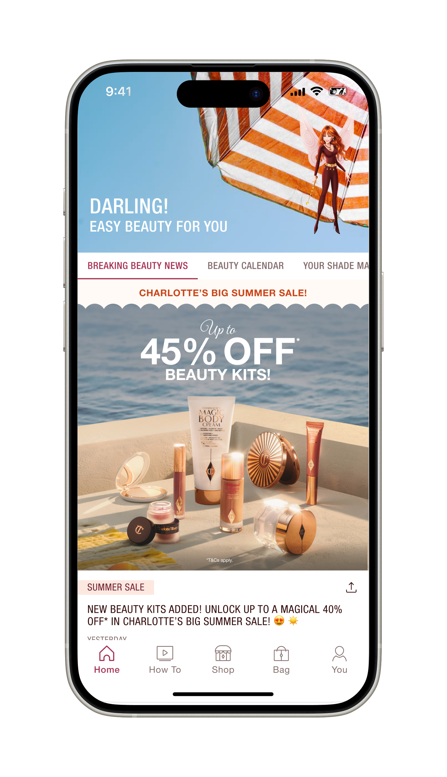
Core Visual Theme: A “Summer Glow” motif: warm, rich tones (peach, coral, soft gold) overlaid subtly on hero imagery. This helps convey warmth and seasonal mood but allows product imagery (lipsticks, palettes) to remain crisp and visible.
Overlay & Gradient Strategy: Gradient overlays fade from warm tones (soft apricot / rose) into transparent areas to preserve contrast and clarity on product shots.
Badge / Accent Treatments: Use of gold / metallic textures on badges (“-30%,” “Bundle”), subtle shine gradients, or soft rim lighting to evoke premium quality.
Imagery & Composition: Hero image composition gives breathing room (i.e. negative space) to place headlines/CTAs. The product shots remain in neutral backgrounds so they are legible.